London City of Wonders: The Icons That Made a City Unmistakable
Some cities are places. London is an idea.
You do not need to see the name written down. A red double-decker bus rounding a corner, a black cab in the rain, the silhouette of Big Ben against a grey sky, a Beefeater standing at attention outside the Tower — any one of these is enough. London has achieved something that most cities never manage: a visual identity so coherent, so consistently maintained, and so widely reproduced that it functions almost like a brand. And like the best brands, it was not designed all at once. It accumulated, over centuries, through the decisions of engineers, monarchs, designers, and ordinary Londoners going about their lives.
The Red Bus
The Routemaster bus — introduced in 1956 and retired from regular service in 2005 — was not designed to be iconic. It was designed to carry passengers efficiently through the streets of London. But its colour, the particular shade of red that Transport for London has maintained since the horse-drawn omnibus days of the 1850s, made it unmistakable. Red was chosen originally for commercial reasons: to distinguish one operator's vehicles from another's. It stayed because it worked. By the mid-20th century, the red double-decker had become the single most recognisable symbol of London in the world — more recognisable, arguably, than Big Ben itself.
The Telephone Box
The K6 telephone box — the classic red cast-iron design that still stands on street corners across Britain — was designed by Sir Giles Gilbert Scott in 1935, commissioned to mark the Silver Jubilee of King George V. Scott was already famous for Liverpool Cathedral and Battersea Power Station. The telephone box was a smaller commission, but it became his most reproduced work. The K6's proportions — the domed roof, the crown motif, the large glass panels — were derived from the tomb of Sir John Soane in St Pancras Old Church, a detail that gives the humble telephone box an unexpectedly distinguished pedigree.
The Royal Guard
The Changing of the Guard at Buckingham Palace has been performed, in various forms, since 1660. The scarlet tunics and bearskin hats of the Foot Guards — the five regiments of the Household Division — were not designed for tourism. They were designed for war: the red made it easier to identify friend from foe on the smoke-filled battlefields of the 18th century; the bearskins added height and intimidation. By the Victorian era, they had become ceremonial. By the 20th century, they had become one of the most photographed sights in the world.
The Beefeater
The Yeoman Warders of the Tower of London — popularly known as Beefeaters — have guarded the Tower since the reign of Edward IV in the 15th century. Their ceremonial uniform, the Tudor State Dress of dark blue and red with gold trim, dates from the coronation of King Edward VII in 1902. The nickname "Beefeater" is of uncertain origin: it may refer to the rations of beef that royal servants received, or it may be a corruption of the French buffetier, a servant who attended the royal buffet. Either way, the Beefeater in full ceremonial dress has become one of the defining images of royal London — a living connection to five centuries of history.
The Golden State Coach
The Gold State Coach has carried British monarchs to their coronations since George III in 1762. Built in 1762 to the design of Sir William Chambers, it weighs four tonnes, requires eight horses to pull it, and travels at walking pace. It has been used at every coronation since George IV in 1821. It is not a practical vehicle. It is a statement — of continuity, of ceremony, of the extraordinary persistence of British royal tradition across three centuries of revolution, war, and social change.
St. Paul's Cathedral
Sir Christopher Wren's masterpiece was built between 1675 and 1710, replacing the medieval cathedral destroyed in the Great Fire of London in 1666. For nearly three centuries, its dome dominated the London skyline. During the Blitz of 1940–41, it became a symbol of national survival: the photograph of the dome rising above the smoke and flames of the burning city, taken by Herbert Mason on the night of 29 December 1940, became one of the most powerful images of the Second World War. St. Paul's survived. London survived. The dome still rises above the City, now surrounded by glass towers, still unmistakable.
The Visual Language of London
What makes London's visual identity so durable is that it was never planned. The red of the buses and the red of the telephone boxes and the red of the Royal Guard's tunics were not coordinated by a design committee. They accumulated independently, over decades and centuries, and happened to cohere. The result is a city that communicates instantly, across languages and cultures, through a handful of colours and silhouettes that have become, over time, among the most recognisable images in the world.
The great travel poster artists of the mid-20th century understood this. When Tom Eckersley or Abram Games or the anonymous designers of the railway poster golden age wanted to capture London in a single image, they reached for the same vocabulary: the red bus, the telephone box, the dome of St. Paul's, the bearskin hat, the Union Jack. They were not inventing an identity. They were distilling one that already existed — and in doing so, they fixed it in the imagination of everyone who saw their work.
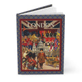
That is the tradition this journal celebrates: the city as it lives in the imagination, vivid and ceremonial and unmistakably itself.
Carry it with you: London City of Wonders Journal — Vintage Travel Poster Style.