L’Illustration Horticole: The Golden Age of French Botanical Chromolithography
In the second half of the nineteenth century, a Franco-Belgian horticultural journal set a new standard for botanical illustration. L’Illustration Horticole, published between approximately 1854 and 1896, was not merely a scientific publication — it was a showcase for the most advanced colour printing technology of its era, and for the extraordinary diversity of plants that European horticulture was producing at the height of its golden age. Its chromolithograph plates, produced with a precision and vibrancy that no other printing technique of the period could match, remain among the most beautiful botanical images ever made.

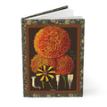
The Floral Journal from LeBonJournal celebrates two of those plates: a Tagetes chromolithograph on the front cover and an Œillets de Verviers carnation plate on the back, both set on a warm brown background with an orange frame that gives these extraordinary images the warmth and presence of a museum botanical display.
The Technique: Chromolithography and Its Colours
Chromolithography — the process of printing in multiple colours using a series of lithographic stones, one for each colour — was developed in the 1830s and reached its peak of refinement in the 1860s and 1870s. For botanical illustration, it was transformative. Earlier techniques — hand-coloured engravings, aquatints, woodcuts — could achieve beauty, but they could not achieve the saturated, luminous colour that chromolithography made possible. The blazing orange of a marigold, the deep carmine of a carnation, the cream white of a bicolor petal — these were colours that chromolithography could render with a fidelity that approached the flower itself.
L’Illustration Horticole exploited this technique to the full. Its plates were produced by the finest lithographic workshops in France and Belgium, using as many as a dozen separate colour passes to achieve the depth and nuance visible in the best examples. The result was a publication that was as much an art object as a scientific reference — something that horticulturalists displayed as well as consulted.
The Front Cover: Tagetes (Marigold, c. 1870–1890)
The Tagetes plate is a chromolithograph of exceptional vibrancy. It presents varieties of Tagetes erecta — the large pompom-headed African marigold, whose flowers can reach the size of a fist and whose colour ranges from pale lemon yellow through deep gold to blazing orange — alongside Tagetes patula (figure 4), the French marigold with its characteristic bicolor striped petals of orange and deep mahogany red. The lower section of the plate includes scientific cross-sections of the florets, combining artistic beauty with botanical precision in the manner that made L’Illustration Horticole the reference publication for horticulturalists across Europe.
The Tagetes had been cultivated in Europe since the sixteenth century, when Spanish conquistadors brought seeds back from Mexico and Central America. By the nineteenth century, European horticulturalists had developed hundreds of varieties, and the marigold had become one of the most popular garden flowers on the continent — valued for its vivid colour, its ease of cultivation, and its remarkable resistance to pests. The chromolithograph captures this popularity at its peak, presenting the marigold with the seriousness and beauty it deserved.
The Back Cover: Œillets de Verviers (Carnations of Verviers, c. 1870–1890)
The carnation plate celebrates a specifically Belgian horticultural tradition. Verviers, a city in the province of Liège in eastern Belgium, was renowned throughout Europe in the nineteenth century for its carnation breeding — a tradition that produced varieties of extraordinary colour range and petal complexity. The Œillets de Verviers plate presents an astonishing spectrum: from cream white through rose pink to deep carmine and intense wine red, with the bicolor striped varieties — white petals edged or streaked with crimson — most prized in European horticulture of the period.
The artistic style is identical to the Tagetes plate — the same chromolithographic technique, the same combination of full-flower portraits and botanical cross-sections, the same luminous colour saturation — ensuring perfect visual coherence across the full-wrap cover of the journal. Together, the two plates represent the full range of what chromolithography could achieve: the warm, solar energy of the marigold and the cool, aristocratic complexity of the carnation.
The Journal: A Museum Display You Can Write In
LeBonJournal has placed both plates on a warm brown background with an orange frame — a curatorial decision that gives these chromolithographs the warmth and presence of a museum botanical display, while creating a visual coherence between front and back cover that the original plates, published separately, did not have. The result is a journal that feels like a piece of the nineteenth century — something that carries the colour and ambition of the golden age of botanical publishing into the present.
150 lined pages, a binding that lays flat, paper that takes fountain pen and pencil with equal grace. A cover that reminds you, every time you pick it up, that the garden has always been worth illustrating — and that the best illustrations are worth keeping.