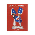
The Alphabet as Art: Gaston Maréchaux and the Illustrated ABC
Teaching a child the alphabet is one of the oldest pedagogical challenges in the world, and every culture that has used an alphabet has had to solve it. The solution, almost universally, has been the same: pair each letter with an image. The image gives the letter a body, a personality, a reason to be remembered. A is not just a shape — it is an apple, an anchor, an acrobat. B is a butterfly, a boat, a bear. The letter and the image reinforce each other, and the child who has coloured the butterfly remembers B in a way that no amount of repetition could achieve.
In France in the early twentieth century, this ancient pedagogical insight was elevated into an art form. The illustrated alphabet — the abécédaire illustré — was one of the most refined genres in French children's publishing, a form that required the artist to find, for each of the twenty-six letters, an object or scene that was at once visually charming, pedagogically clear, and artistically satisfying. Gaston Maréchaux was one of its finest practitioners.
Gaston Maréchaux and the World of French Children's Illustration
Gaston Maréchaux (1872–1936) worked in the golden age of French illustrated publishing — the period between the 1890s and the 1930s when French graphic artists, working for publishers such as Hachette, Larousse, and the specialist children's houses, produced some of the most beautiful illustrated books ever made for children. This was the era of Benjamin Rabier, whose animals populated dozens of children's books and advertising campaigns; of Job, whose historical illustrations defined how a generation of French children imagined the past; of Boutet de Monvel, whose Jeanne d'Arc (1896) remains one of the masterpieces of children's book illustration.
Maréchaux worked in this tradition with a particular gift for the small, precise, charming image — the kind of illustration that rewards close attention, that contains more than it first appears to, that makes the child want to look again. His figures have the rounded, friendly quality of the best French children's illustration of the period, and his compositions are models of clarity: each image tells its story immediately, without ambiguity, while remaining visually interesting enough to sustain the attention of a child who is colouring it in.
The A.B.C. à Colorier and Its Method
The A.B.C. à colorier — the ABC to colour — is a deceptively simple object. Each spread presents a coloured reference illustration on the left page alongside the same image in outline on the right, inviting the reader to observe, interpret, and create. The method is pedagogically sophisticated: the child is not asked to colour freely, which can be overwhelming, nor to colour mechanically within lines, which can be tedious. Instead, the child is asked to look — to study the coloured reference, to understand how Maréchaux has used colour to model form and create atmosphere, and then to reproduce that understanding in their own colouring of the outline.
This is, in miniature, the method of the atelier: observe the master, then do it yourself. The coloured reference is not a constraint but a conversation — an invitation to agree or disagree, to follow or to diverge, to understand why Maréchaux chose the colours he chose and then to make your own choices. A child who has worked through the A.B.C. à colorier has not just learned the alphabet — they have had their first lesson in looking at images with attention and intention.
The Letter and the Object
The heart of any illustrated alphabet is the relationship between the letter and the object that represents it. This relationship is never as simple as it appears. The object must begin with the letter's sound — that is the basic requirement — but it must also be visually interesting, immediately recognisable to a child, and capable of being rendered in a small illustration without losing its essential character. Finding twenty-six such objects, one for each letter, is a genuine creative challenge, and the choices an illustrator makes reveal a great deal about their world and their assumptions about the world of the child they are addressing.
Maréchaux's choices in the A.B.C. à colorier are those of a French artist working in the early twentieth century, and they reflect that world with charming specificity. The objects he selects are drawn from the everyday life of a French child of the period — the domestic world of the home and garden, the natural world of animals and plants, the social world of trades and occupations — and they are rendered with the kind of affectionate precision that suggests an artist who genuinely enjoyed the world he was illustrating. Each letter is not just a pedagogical tool but a small portrait of a world.
Colouring as Learning
The decision to make the A.B.C. a colouring book rather than a conventional illustrated alphabet was itself a pedagogical choice of considerable sophistication. Colouring is not a passive activity — it requires attention, decision-making, and fine motor control, all of which are precisely the skills that a child learning to write will need. The act of colouring the outline of Maréchaux's illustrations is, in a very direct sense, preparation for the act of forming letters: the same grip on the pencil or crayon, the same attention to staying within a defined space, the same satisfaction of seeing a blank outline become a coloured image.
But colouring is also, and perhaps more importantly, a form of ownership. The child who has coloured Maréchaux's butterfly has made it their own — has made a creative decision, however small, about how the world looks. This sense of ownership is one of the most powerful tools in early childhood education, and Maréchaux's format exploits it with elegant simplicity. The coloured reference on the left page is not a command but a suggestion; the blank outline on the right is not a test but an invitation.
A Heritage Object
The A.B.C. à colorier is, among other things, a document of its time — a record of how a French artist of the early twentieth century imagined childhood, learning, and the relationship between image and letter. As such, it belongs to the tradition of the great French illustrated alphabets that runs from the woodcut abécédaires of the sixteenth century through the chromolithographic alphabets of the nineteenth century to the sophisticated illustrated books of the early twentieth. It is a small object with a long history behind it, and it repays the attention of anyone who takes the time to look at it carefully.

Our A.B.C. à Colorier coloring book is a faithful reproduction of Maréchaux's original, preserving the coloured reference and blank outline format that made it one of the most charming and pedagogically sophisticated alphabet books of its era.
References
Boutet de Monvel, M. (1896). Jeanne d'Arc. Plon-Nourrit.
Duval, S. (2010). L'illustration de presse en France au XXe siècle. Éditions du Patrimoine.
Lemoine, S. (2004). L'art de l'affiche et de l'illustration en France 1880–1940. Flammarion.
Pennell, J. (1895). Pen Drawing and Pen Draughtsmen. Macmillan.
Thiesse, A.-M. (1999). La création des identités nationales: Europe XVIIIe–XXe siècle. Éditions du Seuil.